

Friday, 30 September 2011
research and planning: music magazine collage
Thursday, 29 September 2011
research and planning: magazine evaluation
I think the layout of the magazine, is quite effective because it has something related to the college in the background. Addition, the slogan of the magazine helps you draw your attention in. But I think what I could of done if I had more time was to make the writing f the stories stand out and make them all one colour instead of 3 different shades of blue.
I think that the content page fit in well with the front cover of the magazine because it has similar fonts and the stories are the same. Also the page has a picture of Danny who is on the front cover. But on the other hand the colour isn't really the same which I think I need to improve on.
The font sizes of the front page it, are like what they would have been like on a magazine, the masthead is the biggest font on the page. I think what I could of done better is the layout of the magazine, because normally you get the stories standing out at you, where as I fitted the colour in with the background.
Unfortunately, the magazine doesn't follow the 3 colour rule it was really hard to contrast the colours out of the background, I think when I do it again I will do the colour background and make the image stand out more, instead of blending it in with the background, also I will blur the background to make it stand out more as well.
I think the is enough stories on the front page because normally a magazine will do about 3-6 stories on a magazine photo and I have done 4 stories. Also the stories relate to the college as well which id good because it lets people know about what going to happen.
The photographs, was well taken but because I had to edit it on photo shop, the side of his face looks quite flat on one side. The picture of Danny in the photo is appropriate because it is relating to one of the stories on the magazine. Also the background of Costa is appropriate and has been too good. I contrasted the background and brightened parts of it with photo shop tools. The background of Costa is effective as well because it also relates to one of the stories on the magazine. In the content page there is a couple more photos on it, and a couple of more stories, for each of the stories there is a small picture to go with it, to make it more appealing to the reader.
Altogether, I am happy the way in which my magazine and my content came out, and the fonts that I have chosen, if I was to do a magazine again I would change a couple of things, like the font of the masthead, and relate it to a college, also I would make the image of on the front page stand out and make it have bright colours.
Research and planning: Shot type research


In my first page I had to show what each of the following names of the shot types were, and had to draw what I would see in a camera lens. In my second page I had to do the same again they were more difficult ones to do and a harder choice of image that you had to choose from.
research and planning: pictures for the college magasize


These are the pictures that I have taken for my college magazine, front cover and content page, I have used these for my complete ones. These were done on the SLR camera, so there in high quality.
Friday, 23 September 2011
Research and planning: Completed College magazine


I have used the same font for my front cover from my unfinished front cover; I used Danny instead and took a picture of him outside Costa coffee. I took all my pictures myself. The one thing i could improve on is keeping the colour throughout my magazine, because my colour code does not really match that well.
Thursday, 22 September 2011

research and planning: college magazine plan


This is my draft of what I want my college magazine to look like. This is a plan of my content page and my front cover.
Monday, 19 September 2011
Research and planning: Progress of magazine

In the magazine I got a picture of Amy, and put it as my front cover, I then got a running track picture off the internet and used it as my background. This was until I knew that you weren’t allowed to use pictures off the internet so next lession I will have to re-do my magazine.
Friday, 16 September 2011
research and planning: audience research
Today we went out into the college and asked some students what they did.
We then interviewed Dan Willis, who would spend no more than £5.00 on a magazine, he said that it would pass the time away which is god because it shows that more students will read the college magazine if there was one. He finds the canting the most interesting place because it is where he can socialize and hang around with his mates. Although he wouldn't look for enrichment in the magazine and he didn't know a good name for the magazine.
Lastly, we interviewed Dan Gulden who wasn't really interested in any magazine, because he doesn't like reading. He was very negative about the questions and, he found the most interesting thing about the college was the people and his friends. He wouldn't look for enrichment and he couldn't think of anything for the slug line.
First we interviewed Adam, about what he wanted and what he read from the college magazine.
What we found out from asking Adam, was that he wouldn't spend over £3.00 for the college magazine. Also we found out that he found his subjects interesting, and he would like to know more about enrichment because he never gets to her about it from anywhere.
What we found out from asking Adam, was that he wouldn't spend over £3.00 for the college magazine. Also we found out that he found his subjects interesting, and he would like to know more about enrichment because he never gets to her about it from anywhere.
We then interviewed Dan Willis, who would spend no more than £5.00 on a magazine, he said that it would pass the time away which is god because it shows that more students will read the college magazine if there was one. He finds the canting the most interesting place because it is where he can socialize and hang around with his mates. Although he wouldn't look for enrichment in the magazine and he didn't know a good name for the magazine.
Lastly, we interviewed Dan Gulden who wasn't really interested in any magazine, because he doesn't like reading. He was very negative about the questions and, he found the most interesting thing about the college was the people and his friends. He wouldn't look for enrichment and he couldn't think of anything for the slug line.
Research and Planning: Fonts exercise

In this lession I used diffrent fonts, in the word like popcorn, and use the font to look like its popcorn style font. I got the font off dafont .com.
Thursday, 15 September 2011
research and planning :planning examples of medium close ups


Medium close up is a shot from the shouder to the head to see the facial expression on the face of the person, we had to collect images off the internet to show that I understand the objective of the lession.
research and planning: college magazine and analasys

-
Firstly I can notice, the masthead at the top, this is because it’s bold and in a large colourful font.
-Also, I notice that the stories and the strap lines are all in a simple font, and the headlines in a little bit bolder type text.
- The other thing is that the student in the front of the magazine has bright colours on, and looks like a college student.
- What I have also noticed about the magazines is that they are only about 4 different colours on it, in the background; the background is also blurred out so you can see the main image clearer.
- There is a bare code in the bottom right hand corner, with the price just at the side of it.
- There is also an issue number, and a date on the top right hand corner, this makes it out of the way but also very noticeable if you are looking for it.
- There is also a slug line which is parallel to the date and issue number but on the left hand of the magazine.
research and planning: college magazine and analasys

In media I learnt how to use in design, we had to do a review of a film and get a picture off Firefox.
- Firstly I went on fire fox and searched for a review on final destination 5. When I found one I then had to transfer it on to word.
- Then I got a picture of final destination 5 and put it onto the desktop.
- I had to change the colour of the text and had to put columns in to make sure it was in line. I then had to put the text onto the page and then changed the colour of the background.
Monday, 12 September 2011
research and planning: Photoshop challenge

-I firstly had to get an A4 document up on Photoshop and put 'media studies' in 24 foot, central gothic.
- Then I had to change the colour of the font to red and make the background blue whilst drop shadowing the text.
- I got a picture of Katy Perry, off Firefox and placed it under the text.
- Then I changed her hair colour of her hair and I put a border round the picture.
Friday, 9 September 2011
Research and planning: Photoshop challenge
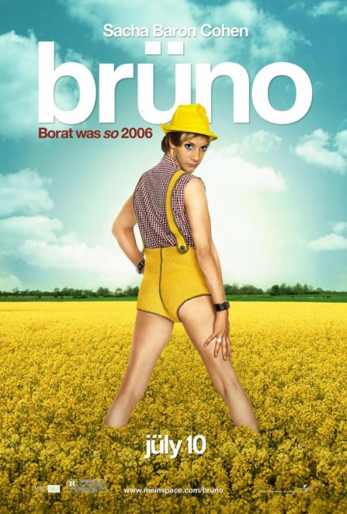
Today I used Photoshop to create a new poster of Bruno; I have done this by......
- Taking a picture of my face and resizing it to put it roughly the way he has.
- Then I used the hue saturation button and made my face a little more yellow.
- Lastly I rotated my face to make it more realistic.
Research and planning: Photoshop challenge

- firstly i duplicated the layer and made her skin look better by going on smart blur.
- then i used the brush to do the lips and her blusher and her eye shadow.
- then i used a smaller brush to do the eye lashes.
- lastly i used the brush tool and put the capacity up and changed the colour of the background.
research and planning: Skin tutorial

I made her skin look better by duplicate the layer of her face to make it look better. I then add a bit of shine to her cheeks. I added eye lashes and made her eyebrows better, and made her have eye shadow and made her lips pink. I edited the background.
Thursday, 8 September 2011
Research and Planning: Introduction to Photoshop

Firstly I cropped the c.d with the circular editor
- Then I changed the colour by going onto adjustments and changing the shadows and highlighted it.
- Then I used the burn tool on the horn and smoothed the edges to make it look shinier.
- I then radar the c.d so it stood out more. And smoothed the piano in the c.d as well.
- I re- coloured the notes that are coming out of the horn. I did this by hue saturating it.
- Lastly I made the background of the notes wavy by going on filter and distort, on photo shop.
Subscribe to:
Comments (Atom)